Hi, artists! My name is Jazzy (@j.l.s_art on instagram) and I’m here to talk to you about color schemes. When I first began using color in my art I was intimidated by the color options. However, I’ve learned that sometimes limiting a palette can help my creativity flow in other ways. In today’s painting, I chose a complimentary color scheme, which means that the colors are directly across from each other on the color wheel. By doing this, I made both the blue and orange pop against each other and made room for experimentation in other areas (GLITTER!). 
I began by choosing a reference photo that had simplified colors. In the reference, the colors mostly consist of orange and black. I decided to substitute the orange in the painting for blue and the black for orange. Once I’d done this, I began gathering my materials and planning my sketch.
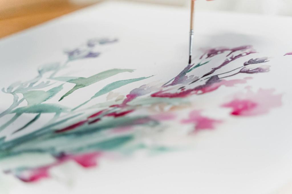
 For my materials, I gathered some 8×10 watercolor paper, painter’s tape, two cups of water, paper towels, a pencil, brushes, and paint. My brushes include a small round brush and a ¾ flat brush. For my paints I used Lemon Yellow, Crimson, Cerulean Blue, and Phthalo Blue. I also used the shades “Cleopatra” and “Agustin” from Waves of Expression’s watercolor shop. I added some water to the back of the page to prevent curling, taped the page down, and got to work.
Once I’d completed the sketch, I put down my first layer of paint. I wanted to create a shimmering effect under the whole painting. To accomplish this, I added a thin layer of the gold paint “Cleopatra” under the orange section, and a layer of “Agustin” under the blue section. 
Next, I worked to build up the skin tones. I chose Cerulean Blue for the blue and started with the darkest values first. After establishing these zones, I added layers until I had created a texture similar to skin. I used my large, flat brush to block in colors before softening the edges using my small round brush to give the appearance of skin. I let this layer dry before adding Phthalo Blue to the darkest values to add more contrast where it was needed, such as the eyelid, nose, and chin. I also began working on the candle where I used less blending, mostly letting the paint bleed by adding more water for its first layers. 
It was time to start building up the orange, so I blended Lemon Yellow and Crimson until I had the dark orange shade that I wanted. I used an orange wash and was careful not to get too close to the flame of the candle so it would appear to glow. I continued adding to the orange until I had achieved a gradient with the darkest shade in the corner of the piece. 
As I was building up the orange layers, I got a little too close to the flame of the candle so I used a paper towel to blot some of the\paint off. It ended up creating a cool effect so I decided to repeat the process around the rest of the painting. After I finished my blotting, I would reapply the orange shade to the darkest sections to maintain the contrast that I was trying to build. 
When I was satisfied with the orange and gold, I went back in with the gold watercolor “Cleopatra” and applied a layer to the orange section of the painting. Adding the gold was like adding the magic of the moment. I chose this particular reference because it reminded me of when I was a child and would sit and watch flames dance for hours. It’s a special memory and the subtle but impactful flecks of gold that it added made the painting feel more like a memory than an image. 
While the Gold created the atmosphere of the painting, the silvery-blue paint called “Agustin” that I used brought the flame and girl to life. Despite blue being a cool tone, the use of the paint created a glow that radiated off of the page.
By limiting my palette to a complementary color scheme, I was able to have more fun layering the gold and blue glitter paint to breathe life into the painting. It was my first attempt painting a candle and I am glad I invested in some beautiful watercolors to create the effect I wanted. It truly does shine!


What did you think of this idea??